Colouring By Numbers
Contents
Introduction
What is Colour?
The Visual Sensation of Color
Graphical Representation
Colour Perception
The Visible Spectrum
Uniform Colour Space
Colour Measuring Instruments
Assessment of Colour Difference
Visual Assessment
Instrumental Measurement
Coats Colour Capsure device
Introduction
Color is not a physical reality, hence different people perceive Color differently. Generally, when asked what Color a certain object is, one may reply with subjective responses, such as ‘light blue’, ‘rich dark purple’ or ‘bright gold’ which may differ from individual to individual.
With advances of technology, Color specification has become a precise science by specifying a thread Color quantitatively as a number. It improves the understanding of Color and the Color matching process.
This technical bulletin will explain the standard systems which specify Color in numerical form.
What is Color?
There is no simple answer, since Color is not a physical reality. It is a psychological response by an individual to the different wavelengths of radiant energy. Hence, Color can be described as the appearance of an object which is an interpretation of sensations detected by the eye.
Color Perception
The human eye is a very sensitive organ, it is believed we can discriminate between seven and ten million Colors.
However:
- We have no precise Color memory
- Approximately 1 in 12 men have defective Color vision
- Approximately 1 in 250 women have defective Color vision
- The perception of Color is different from person to person
- The eye-brain is also deceived by many secondary factors such as ambient lighting, background Color, medication and alcohol
- When working with Color we have to accept some of these limitations but we try to remove as many of these factors by comparing Colors under controlled conditions.
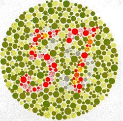
Defective Color Vision
Despite such high levels of defective Color vision many people working in positions which involve Color approval have never had their Color vision tested.
Ishihara and Dvorine tests may be used to screen for Color defectives, both these tests work by asking the subject to identify numbers composed of Colored dots against a background of Colors that are likely to be confused by people suffering from Color deficiencies.
In this section we will examine some of the factors that deceive the eye-brain during Color assessment.
Daylight
Natural daylight, which is usually the preferred light source for colour evaluation, varies considerably with:
- The time of day
- The season
- The latitude
- The weather conditions
Artificial daylight created in a light box is known as D65.
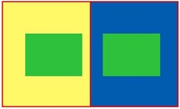
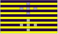
The images below demonstrate how background and adjacent colors have an affect on our perception of color.
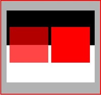
Background
The green rectangles are exactly the same Color. It is the influence of the yellow and blue background which makes them appear different. The eye takes the opposite of the Color of the background and adds it to the object thereby affecting the Color being viewed.
Adjacent colors
The small grey squares appear to be different in Color with the upper ones appearing darker than the lower ones. In fact the grey in all squares is exactly the same. It is the Colors adjacent to the grey squares that lead us to believe that the upper squares are darker than the lower squares.
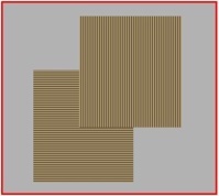
Orientation
Changing the direction of some samples can change the Color appearance. The orientation of the sample can also affect Color measurement. It is therefore important when comparing two samples they are viewed or measured in the same orientation.
Opacity
Variations in opacity particularly in a fabric sample can have a major effect on the appearance and on the measurement of Color especially with lightweight materials in pale shades. Ideally all fabrics should be folded until they appear opaque.
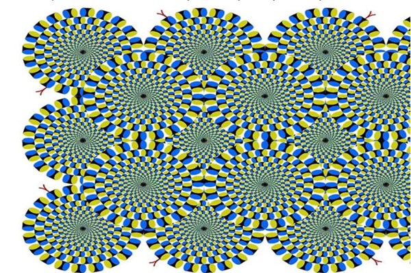
If you take a look at the following non-animated picture, your eyes will make it move. to test this, stare at one spot for a couple of seconds and everything will stop moving. Or look at the black centre of each circle and it will stop moving. But move your eyes to the next black centre and the previous will move after you take your eyes away from it... weird!
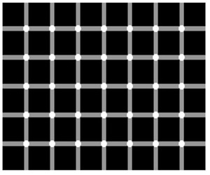
Try and count the black dots on this image!
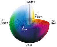
The Visual Sensation of Color
There are many methods of describing a Color using a three-dimensional representation of space. In the Color vision method, the visual sensation interprets the impression of Color on the basis of hue, chroma and lightness.
Hue is how we usually perceive an object’s Color and is the attribute of visual sensation which gives rise to Color names - violet, blue, green, orange, red, purple, etc.
Chroma (saturation or purity) is used in visual sensation to assess the proportion of chromatically pure Color (monochromatic). Chroma describes the vividness or dullness of a Color. It indicates how close the Color is either to grey or to the pure Color. It is independent of hue.

Lightness describes the extent by which the object being viewed appears to transmit or reflect a greater or lesser amount of light. Colors can be classified as lighter or darker when their values are compared. For example, when placing a tomato and a radish side by side, the red of the tomato appears to be much lighter in contrast to the radish which has a darker red value.
Graphical Representation
Hue is represented by a circle called Color circle shown in the image.
Chroma changes on the horizontal plane, where the Colors in the centre are grey (dull) and become more saturated (vivid) as they move towards the right.
Lightness is represented on the vertical axis. Each Color can be characterised by these three values, hue, chroma and lightness, which describes a unique Color, and in this way we are able to create a three dimensional system for the representation of Color.
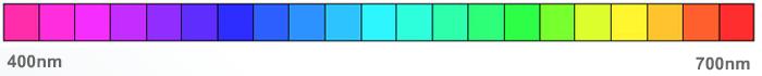
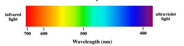
The Visible Spectrum
The visible spectrum is the portion of the electromagnetic spectrum that is visible to (can be detected by) the human eye. The spectrum does not, however, contain all the Colors that the human eyes and brain can distinguish. Unsaturated Colors such as pink and purple Colors such as magenta are absent, for example, because they can only be made by a mix of multiple wavelengths. The Colors and their range of wavelengths are shown in the diagram. Color is a function of wavelength of light.
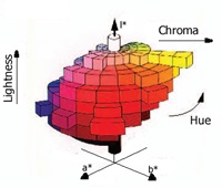
Uniform Colour Space
The whole range of Colors adds up to a space contained within a structure. Color spaces are geometric ordering of Colors within the range of visual sensation. A defined Color space model illustrates the ability to specify Colors using numbers, thereby providing a criterion for objective classification.
Two examples of 3-dimensional Color space models defined by C.I.E. (Commission Internationale de l'Eclairage) are explained here:
1. CIELAB System
2. CIELCH System
CIELAB System
The CIE L*a*b* Color space is the most widely used method for measuring and ordering object Color. L*a*b* Color is closely designed to approximate human vision.
It describes all the Colors visible to the human eye. It is routinely employed throughout the world by those controlling the Color of textiles, inks, paints, plastics, paper, printed material and other objects.
In the CIE L*a*b* Color space, the 3-dimensional Color co-ordinates are:
- L* - the lightness co-ordinate (L* = 0 yields black and
L* = 100 indicates white) - a* - the red/green co-ordinate with +a* indicating red and - a* indicating green
- b* - the yellow/blue co-ordinate, with +b* indicating yellow and -b* indicating blue
CIELCH System
In this method, L* co-ordinates are the same as in CIE L*a*b*, while the C* and h* co-ordinates are computed from the a* and b* co-ordinates.
The same Color is still in the same location in the Color space, but CIELAB and CIELCH are two different ways to describe its position.
CIE L*C*h* Color space is three dimensional, with Colors located using cylindrical co-ordinates as follows:
- L* -the lightness co-ordinates
- C* -the chroma co-ordinate, the perpendicular distance from the lightness axis
- h* -the hue angle, expressed in degrees, with 0° being a location on +a* axis, continuing to 90° for the +b* axis, 180° for -a*, 270° for -b* and back to 360° = 0°
Assessment of Colour Difference
A reliable method of assessing Color difference is very important. Incorrect Color could lead to rejection, which means unnecessary loss of time and money.
There are two ways to assess the color:
1. Visual assessment
2. Instrumental measurement

Visual Assessment
In visual assessment viewing conditions are extremely important if the right judgements are to be made. The following points should be taken into consideration while visually assessing Color:
- The level of illumination must be sufficient to produce cone (photopic) vision
- The illumination should be a good simulation of one of the CIE standard illuminants
- The nature of the background against which the sample is viewed must be controlled; the background should be a neutral grey Color such as Munsell N5 or N7
- The field of view should be controlled. If the panels are of different size or shape, then a mask should be cut from thin grey card and placed over the panels so that equal areas of the two panel are in view
- The two panels should be positioned side by side, with no gap between them
- Always position the standard on the same side of the pair, usually the left hand side
- Allow a few moments for the eye to become adapted to the ambient illumination in the lighting cabinet before viewing the Color difference panels
- If highly chromatic panels have been viewed, then allow a few minutes for the eye to readapt to neutral before judging the next pair of panels
Colour Measuring Instruments
Two types of instruments are used for the measurement of Color:
- Tristimulus colorimeters
- Spectrophotometers
Tristimulus Colorimeters
Uses
Tristimulus colorimeters supply numerical data representing absolute value, and Color difference between a reference sample and a sample to be tested. They are used mainly in quality control, to determine conformity to standards compatibility with specified tolerances.
Working
Light is shone onto the object and part of the reflected light is collected, analysed and the intensity recorded.
Advantages
- Short measuring time
- Easy to use
- Relatively low cost
Spectrophotometers
Uses
Spectrophotometers are at the centre of any modern Color formulation, Color production or Color quality control system.
They are designed specifically for the measurement of Colored material. They measure the photometric characteristics of the material in the visible spectrum and produce spectral graphs of the samples.
They are also able to determine the appearance of samples under different illuminants, and can therefore calculate metamerism.

Working
Light is shone onto the object and part of the reflected light is collected, analysed and intensity recorded. However, in reflectance spectrophotometers, the intensity of the reflected light is measured at a series of discrete wavelengths spaced at 5, 10 or 20 nm throughout the visible spectrum (usually 380 to 730 nm or 400 to 700 nm).
Advantages
- High degree of accuracy
- Multiple parameters can be measured at the same time
Instrumental Measurement
The spectrophotometer can measure the reflectance values of standard as well as batch of any object. These values can be converted into Color difference values using CIELAB and CMC mathematical equations.
Using the CIELAB System
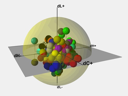
In the CIELAB system, the total Color difference Delta E combines the difference of three variables L, a and b or L, c and h. The parameter Delta E represents Color difference. Delta E is found using the differences in all other dimensions to calculate a single number. The term Delta E is derived from the German word for sensation, Empfindung. Delta E therefore literally means difference in sensation.
The primary limitation on the use of CIE L*a*b* is the non-uniformity of the Color space. This leads to problems with the Color’s acceptability. Different numerical tolerances must be applied to different standard Colors depending upon their location in the Color space.
The CMC Equation
The industries in which Color difference formulas are used a great deal, either to evaluate tolerances or to automate conformity testing (in the textile industry in particular) and which traditionally use the CIELAB space, have reached the conclusion that the CIELAB differences sometime lead to errors. A scientist at Coats – Dr. Roderick McDonald developed the JPC equation in 1979, which was later adopted by Color Measurement Committee of Society of Dyers and Colorists and which led to the CMC Equation. The CMC (2:1) equation is used in the textile industry for instrumental Color assessment. In this equation corrections are made for lightness, chroma and hue differences..
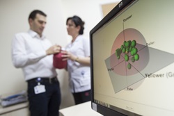
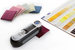
Coats Colour Capsure device
At Coats we know the importance of measuring Color accurately and the need to provide thread and zips samples quickly. Coats Color Capsure is a handy portable Color measuring device to complement the spectrophotometer which is normally kept for use in a laboratory.
1. The Capsure portable device is loaded with Coats standard Color cards, stock shades and other Color references
2. It helps control variables in the Color selection process, such as lighting conditions, viewing angles, atmospheric conditions, background effect and the perception of the human eye
Features and Benefits:
- Precision, accuracy and speed in the Color matching process
- Improved efficiency: helps in getting the right match the very first time, thereby saving time and resources
- Wastage and cost control
- Access to various Color schemes such as Coats standard Color cards, stock shades and other Color reference guides
- Higher success rate on approvals
- Scope for loading customer’s own stock range as fan deck
- Minimising obsolete stocks
Please visit www.coatsColorexpress.com or contact your local Sales Office to find out more about Coats Color Capsure device.